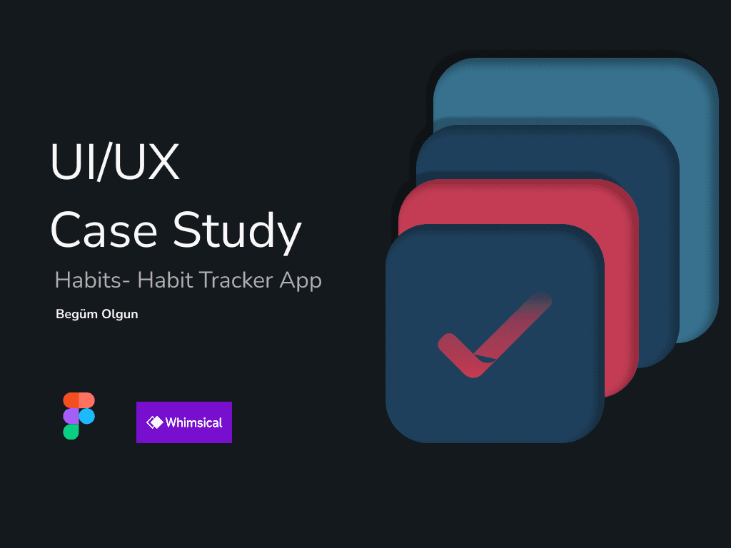
App Design

Habits App
Case Study

Overview

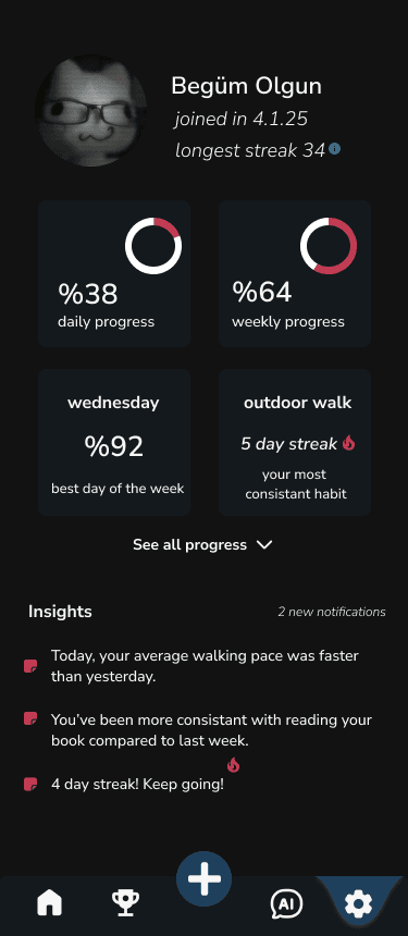
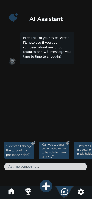
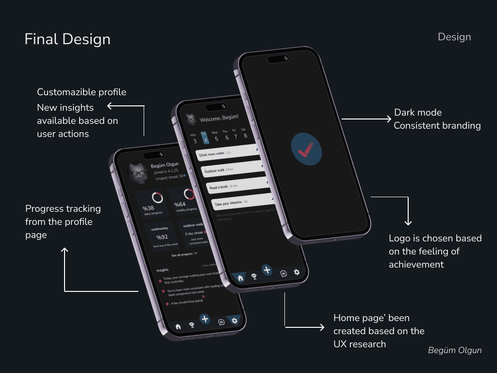
A habit tracker app design. It has four main pages: a home page, a challenges page, an AI assistant page, and a profile page. It has been made by using Figma and whimsical as well as pinterest, behavior, and dribble for inspiration.

Approach

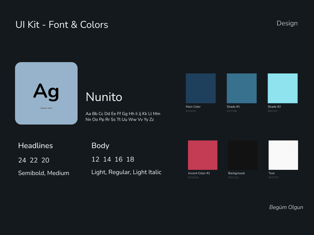
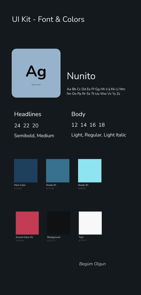
Competitor analysis, user flow and information architecture was the main research for this case study. I've also taken in consideration of my own experiences with habit tracker apps. It has a dark, sleek, modern design.

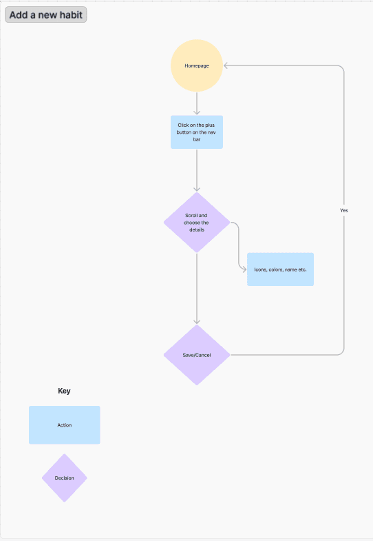
I started with identifying the app needs and empathizing with the user. I created my user flows and information architecture.

After completing enough research and looking at many designs for inspiration, I started brainstorming and putting my ideas on paper.

Those sketches and wireframes turned into real based designs. I created my final design pages and prototyped my design.

Based on my benchmark research, I’ve decided to create a couple of user flow examples to be able to understand the users journey better.

Based on my benchmark research, I’ve decided to create a couple of user flow examples to be able to understand the users journey better.

After roughly deciding my app flow, I started the information architecture. Looking at everything I need and deciding my page information, helped me understand the product better.

After roughly deciding my app flow, I started the information architecture. Looking at everything I need and deciding my page information, helped me understand the product better.

After mostly finishing my research, I strarted brainstorming. I looked at some examples from dribbble and behance as well as pinterest for color schemes and overalll inspiration. Pinterest is my OG go-to website :)

I started sketching my ideas with pen and paper while browsing and the pages started forming itself. The pages that I liked, I created digitally. I created my low-fidelity wireframes using whimsical. After that I created the high-fidelity wireframes on figma to be able to create my design with the overall grid in mind.

When I finished my hi-fi wireframes, I started my branding. I decided to create the logo and find a suitable font from google fonts. I searched some high quality pictures that were needed and starting putting it all together.

When I finished my hi-fi wireframes, I started my branding. I decided to create the logo and find a suitable font from google fonts. I searched some high quality pictures that were needed and starting putting it all together.

Based on my design knowledge and aesthetic, I made my design choices and implemented it to the pages.

Based on my design knowledge and aesthetic, I made my design choices and implemented it to the pages.

Creative solutions.

Creative solutions.

Creative solutions.